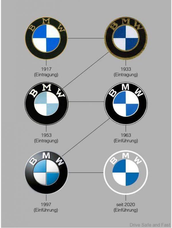
Last week, BMW surprised motoring press the world over with the unveiling of a new logo. The flat, minimalist look of the new logo was said to help futureproof the brand. To be fair, we should have seen this coming. Just a few years ago, MINI, who are under BMW Group, did a similar flat, minimalist logo design change. And to be fair to BMW, this isn’t the first time they’ve changed the logo. As seen in the chart below, their logo has changed four times before 2020. A minor revision in 1933, the removal of bronze elements from the logo in 1953, a cleaner look in 1963, and the familiar 3-dimensional logo from 1997.

What we wanted to know was how the brand’s new logo would look like on white coloured BMWs. Many popular models, like the 3-Series, are often seen in Alpine White. With the ‘BMW’ lettering and borders finished in white on the new logo against a transparent background, nothing would show but the blue sections.
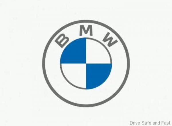
We spoke to BMW Malaysia’s Head of Communications last week and got an answer. He said on white models (and on press material with white backgrounds), a different logo would be deployed. It looks like this:

Sure enough, over the weekend, we saw this variation of the new logo appear on BMW Malaysia’s Instagram page and website.

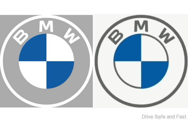
Here’s how the two new logos look next to each other:

Notice that this not just a colour swap for the white backdrop logo. It almost resembles the 1963 logo, with a coloured border around the central circle. The standard new logo has that circle floating borderless.
What do you think of this dual logo approach? Any thoughts on the new logo in general?