
With the outbreak of COVID-19 ongoing and car sales the world over undergoing a massive slump, the auto industry is in massive turmoil. Car companies all over have either shut down production entirely or shifted production towards medical equipment like face masks, medical shields and ventilators. It’s nice to see normally profit-driven companies taking steps to help their communities become safer and more equipped to deal with this pandemic.
Rather proactively, some brands have taken to redesigning their iconic logos to promote social distancing. This started about a week plus ago and as far as we can tell, just four car companies have done this.
Mercedes-Benz

For the Mercedes-Benz 3-pointed star — arguably the most recognisable logo in the world — the redesign pushes the star towards the centre and away from the surrounding circle. It looks like the centre portion has been scaled down rather than shortened, while the outer circle remains in in its standard size.
Audi

This one is our favourite. The “brand with the four rings” as they like to call themselves in press releases puts some distance between each one of those rings. Audi have opted to use their ‘digital-first’ flat, black and white logo for this. It’s a logo they introduced in 2017, though in many physical appearances, their 3-dimensional logo still appears. We thought this was the best ‘social distancing’ redesign because the four rings represent the coming together of Audi, DKW, Horch and Wanderer. Pushing them apart has a strong symbolic meaning.
Hyundai

The Hyundai logo redesign is perhaps the most recent of the four. It’s also rather clever. The H has split apart to symbolise refraining from shaking hands. It could also be interpreted as two people moving their hands to cover their mouths mid-cough. What do you think?
Volkswagen
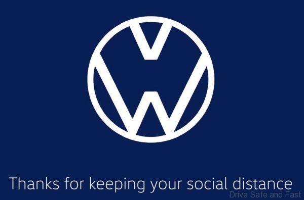
The Volkswagen logo redesign increases the existing gap between the ‘V’ and ‘W’ on the recently redesigned flat logo.

My Thoughts
It’s quite an interesting way to bring some brand awareness in a time of crisis. The people behind the brands are probably aware that there are a lot of people sitting at home looking for something to read online. Strangely enough, we’ve seen reports from friends in Singapore last week before their own mild lockdown was announced. Apparently a lot of people there aren’t taking it as seriously as us Malaysians. First of all, that should make us proud. But secondly, these brands using their logos to promote social distancing might give the movement greater legitimacy and momentum particularly for those who still think COVID-19 is just an advanced version of influenza. And hey, Audi and Hyundai are both really popular in Singapore, so perhaps they should promote these logo changes there a little harder.