
Many car makers, especially in the premium segment, have started to go fully digital with their instrument clusters. While they’ve all taken their own individual approaches to adapt to this new technology, there’s one thing that unites every single one of them: information overload.
I get that the whole point of a digital instrument cluster is that you get to present more meaningful information to the driver, but I see it as a distraction.
Readability vs Volume
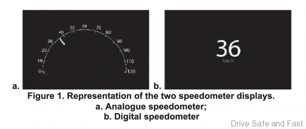
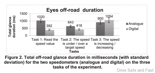
There is research that suggests that digital speedometers require less time to read and respond to than analog speedometers. And I don’t doubt that at all. However, some research usually focuses on just the speedometer. And of course, when you have the vehicle’s speed displayed in just one, two or three digits, it takes nearly no time at all to decipher the information. A traditional gauge can never have that kind of pin-point accuracy.
But it’s not the legibility of key pieces of information that I’m writing about here, it’s the sheer volume of data that’s presented and customisable while the car is at speed.
Too many things to do besides driving
In many premium cars, the driver can still scrub through menus to look for particular types of data to be presented WHILE driving. This is especially problematic.
I don’t think manufacturers see this as a big problem, because they have tested the equipment and it has gotten through the required safety checks both internally and externally. But if the whole point of not using your smartphone while driving is to keep distractions away from the driver, surely a bit more attention could be paid to them giving them LESS information to think about while driving
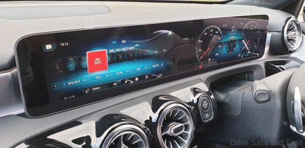
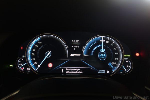
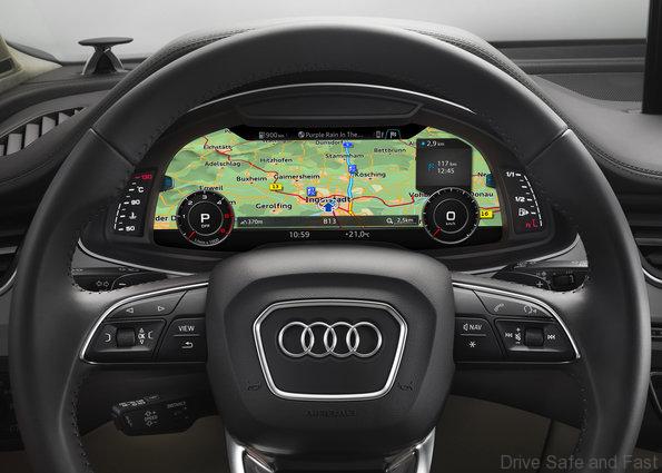
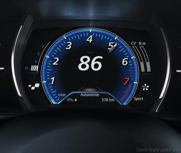
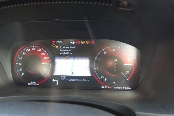
Every premium brand does this. They give you ‘ECO displays’ to visualise your driving behaviour, average and real-time fuel consumption figures, range, gear selection, drive mode selection, 4WD selection, speed limiter information, media information, date, time, navigation, and even whole setting menus to go in and adjust elements.
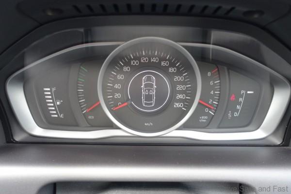
Yes, with the kind of information modern drivers need to deal with, putting everything in one place can seem like the most sensible thing to do. But from my own experience, nothing beats a set of minimalist, functional analogue dials.
What do I do about it?
When I take test cars with digital instrument clusters, I do allow myself to ‘experience’ them in day-to-day driving. But when I drive cross country in these cars, I tend to take as much information away except for ‘Range’. I don’t need to know why ‘eco score’ or how much the turbo charger is spooling up at this current moment, or what % of throttle I’m giving it. I just need to know if I’m breaking the speed limit and when I need to refuel.
Is this just a rant?
Well, yes. But it’s something I genuinely concerns me. Whenever I step out of a modern luxury car and back into my 20+ year old clunker, the one thing that feels like an improvement is the lack of distractions. My phone becomes the largest screen in the cabin and I know not to look at it.
But I don’t think manufacturers are doing something purposefully wrong. I’ve ‘glanced’ at some of the research and there was a lot considered. I think it will get better, but I also think that we’re at the infancy of this technology, so the variety will start to be cut away.
I mean, just look at this one research excerpt from the late 2000s concerning the legibility of colour combinations.
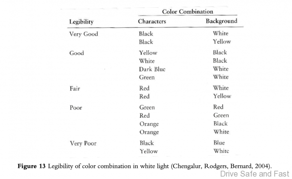
You can see that black characters on a white background is the most legible combination, but most carmakers (besides Lexus in certain drive modes) go for the less effective White on Black variation. Maybe the research has evolved? Or maybe in 10 years, they’ll all sport more or less the same superior colour combination and text layout.