
Can you notice the very small difference in the new Porsche crest?
German automaker Porsche has been a household name in the automotive industry for a whole host of reasons, from its luxury, too its performance to its racing history and heritage, now with the brand celebrating 75 fantastic years, we know that the brand is working on a revised 911, but apparently, the car’s crest is getting a makeover too.
Yes, we have already covered the brand working on a revised Porsche 911 GT 3 which is losing its physical rev counter in favour of a fully digital dial, but Porsche, ever the over-achiever, is also making a change to the brand’s crest which, at first glance, will go right over one’s head.
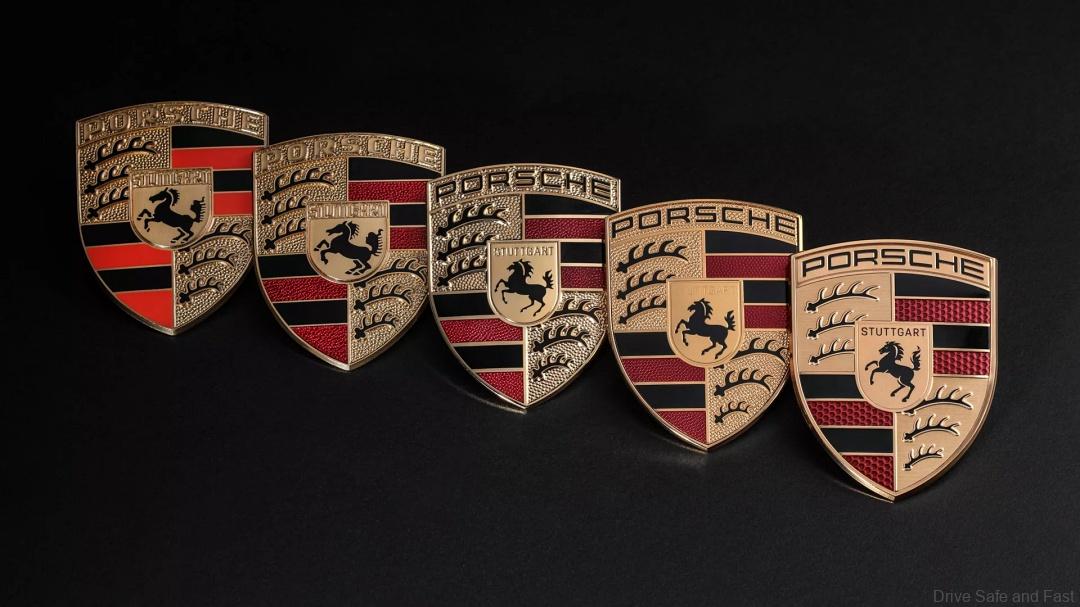
Moreover, Porsche has already fitted the updated crest on some models which were being tested but some truly perceptive photographers noticed that the crest now features a few changes which one can observe in the main image which shows the old and new crest side by side highlighting the difference clear as day.

While some may think that this change is unnecessary, it should be noted that this change in the crest also coincides with the brand’s 75th anniversary so perhaps this might be the reason behind the change and even if it is not, Porsche changing the crest could be indicative of the 911 modernising as it is losing the physical rev counter.
Now we all knew Porsche was never going to change its iconic crest too much, and the changes are certainly not overtly obvious when one looks at the new version on its own as the basic elements such as the Porsche name at the top, the horse at the center and the four quadrants containing black and red stripes and antlers are all still there.
However, when one takes a good look at the old and new versions of the Porsche crest side by side, suddenly the inverted textures as well as sharper and darker colours becomes much more apparent. Other than that the designs, shapes and elements are mostly unchanged and I personally prefer this new version, what about you guys?
On top of that, the new Porsche crest is also now finished in a brushed metal style as opposed to the previous glossier look. Meanwhile the “bobbly” background, which used a honeycomb pattern for the red bars and picked out the ‘Stuttgart’ lettering in black has also been removed resulting in a cleaner and more mature look.
The final noticeable changes to the Porsche crest include subtle revisions to the shape of the six antlers, which are now thinner and the horse in the centre also seems to look a little more realistic and aggressive as it is jumping slightly higher on its back legs. It looks a bit more similar to the Ferrari prancing horse now, in my opinion.
We got all this from Carscoops and their full article is linked here. Thank you Carscoops for the information and images.